
By Senior UX/UI Research Team · Mobile Gaming & Product Design · March 2026
Ask most players why they keep returning to a mobile game and they’ll describe story, competition, or reward. Rarely will they mention the interface. That invisibility is the point — and it’s precisely what separates studios that retain players for months from those abandoned after a single session.
The industry’s design philosophy has undergone a fundamental inversion. Through roughly 2018, mobile game design was visual-first: striking art direction, bold iconography, and high-polish aesthetics were the primary levers for grabbing attention on a crowded app store shelf. Today, leading studios operate under an experience-first doctrine — one in which the visual layer is downstream of behavior, emotion, and cognitive flow.
This shift is not cosmetic. It reflects a growing body of research on how players process, habituate to, and emotionally respond to digital interfaces. Understanding those mechanisms is now a core competitive advantage.
Key Insight: Players don’t notice good UX — they only feel its absence. Designing for invisibility is the highest form of mobile interface craft.
The F-Pattern and the Thumb Zone Made for Human Anatomy
Before any psychological hook can fire, the interface must be physically accessible. Two ergonomic models — the F-Pattern and the Thumb Zone — form the anatomical foundation of high-retention mobile design.
The F-Pattern in Mobile Contexts
Originally documented in desktop eye-tracking studies by the Nielsen Norman Group, the F-Pattern describes how users scan screens in two horizontal sweeps followed by a vertical drift down the left edge. On mobile, this pattern compresses and rotates based on thumb dominance — but the core insight holds: primary actions must occupy predictable scan paths or players will miss them entirely.
In practice, this means:
- Primary CTAs (Draw, Roll, Attack): Core baccarat online prompts should anchor the lower-center zone
- Secondary information (health, currency, timer): Status indicators belong in the upper-left sweep path
- Tertiary features (chat, leaderboard): Social and meta-game features migrate to lower corners — accessible but non-intrusive
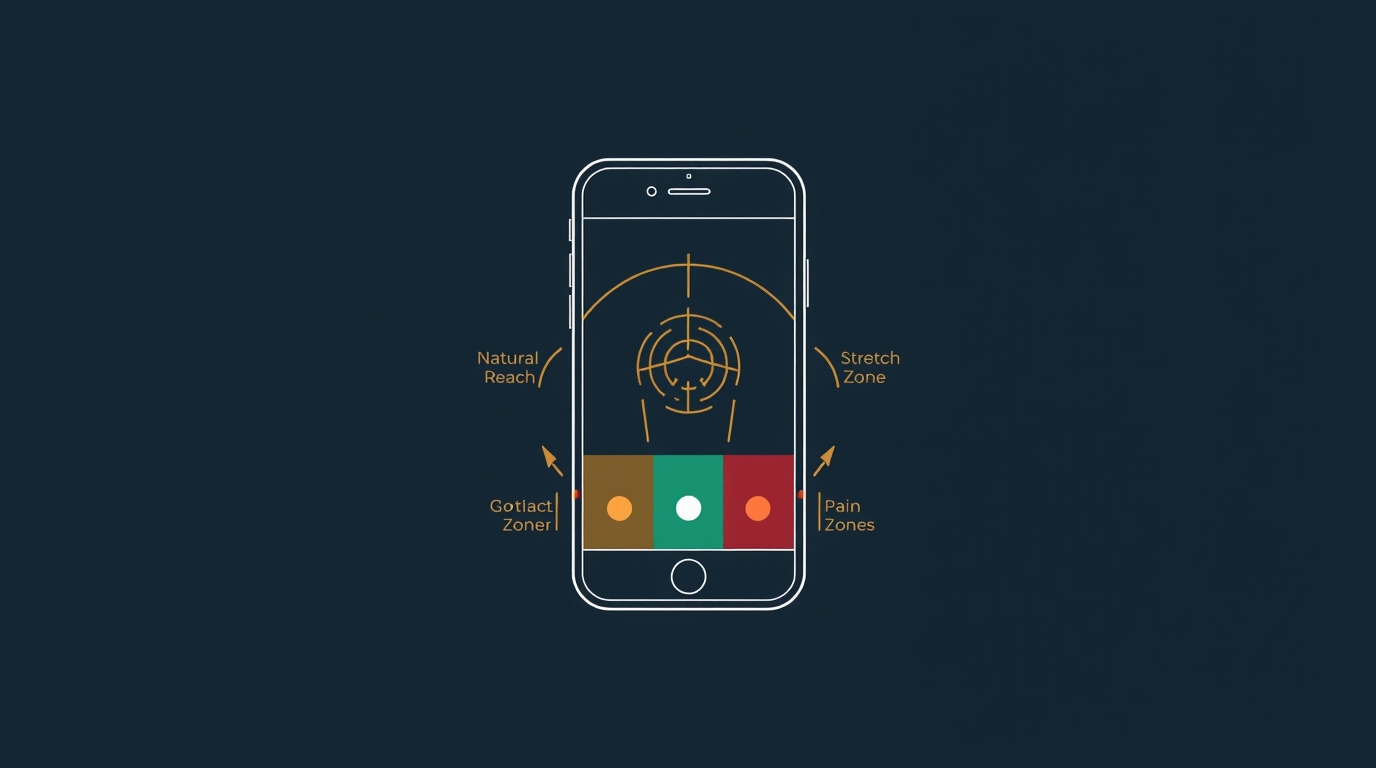
Thumb Zone Mapping
Steven Hoober’s landmark mobile usability research established that roughly 75% of users navigate their phones one-handed. This creates three distinct interaction zones on a standard smartphone display:
- Green Zone — Natural reach: center and lower-middle screen, where effortless taps occur
- Stretch Zone — Upper screen and far corners, reachable with grip adjustment
- Pain Zone — Upper corners, requiring two-handed operation
High-retention games consistently place their most frequent interaction targets in the green zone. Pause menus, settings, and destructive actions (delete, exit) are deliberately marooned in the pain zone — not to frustrate users, but to prevent accidental activation during high-engagement play.
The implication for 2026 design, as device form factors diversify toward wider and foldable screens, is that thumb zone mapping can no longer be a static template. It must be dynamically recalculated based on detected grip orientation and screen mode.
Case Study: Adapting Tabletop Classics for the 5G Era
No design challenge better illustrates the complexity of modern mobile UX than the digital adaptation of tabletop games. These games carry decades — sometimes centuries — of evolved mechanical logic, physical ritual, and social context. Translating them to a 60fps touchscreen environment without losing their essential character is a masterclass in friction engineering.
From Table to Touch: The Friction Problem
Physical card and board games are rich with intentional friction — the shuffle, the dealing ritual, the physical separation between your hand and the discard pile. These frictions are not flaws; they are pacing mechanisms. They create anticipation, enforce turn structure, and give players time to think.
When adapting these mechanics digitally, designers face a binary choice: preserve the friction as a deliberate aesthetic choice, or eliminate it in pursuit of speed and flow. Neither is categorically correct. The decision must be rooted in player psychology.
Clean-Room UI: The Speed-First Paradigm
For games where session velocity is the primary value proposition — fast card draws, rapid round resolution, low decision overhead — the clean-room UI philosophy has proven most effective. The term describes an interface stripped of everything that does not directly advance the game state: no decorative chrome, no ambient animation that carries no information, no modal interruptions between actions.
Modern digital platforms adapting fast-paced card games have increasingly adopted this approach. A well-executed clean-room UI means the player’s eyes never need to leave the action zone — card reveal, result, and next-round prompt exist in a tight visual triangle. Cognitive load is minimized. The game loop becomes nearly automatic, which is precisely what drives session length.
The underlying psychology is Flow, first described by psychologist Mihaly Csikszentmihalyi: a mental state of complete absorption in a task, achieved when challenge and skill are in balance and feedback is immediate. Clean-room UI is, at its core, a Flow delivery mechanism.
This design philosophy extends beyond traditional card mechanics into adjacent high-velocity genres. For example, if you are looking for bitcoin slot machine experiences, the same clean-room UI principles apply: instant feedback loops, minimal visual noise, and tightly clustered interaction zones are critical to sustaining momentum. In these environments, even micro-delays or misplaced controls can break Flow and reduce session duration, reinforcing the idea that UX precision is not just aesthetic — it directly impacts engagement and retention.
“Every UI element that doesn’t communicate game state is a Flow interruption. In high-velocity card games, even a 200ms animation delay on a result display measurably increases abandon rates.”
Key Takeaways — Tabletop-to-Digital Adaptation:
- Map the physical ritual. Identify which frictions create anticipation vs. frustration, and preserve only the former
- Establish a visual triangle of action, feedback, and next prompt — all within thumb-zone reach
- Use 5G latency budgets aggressively: sub-100ms server response enables real-time multiplayer without UI masking layers
- Test with eye-tracking to confirm players are not hunting for their next action
Haptic Feedback & Micro-interactions

Visual design captures the eye. Haptic and audio design captures the nervous system. The most retentive mobile games in 2026 treat touch, sound, and motion as a unified sensory language — what the industry calls “juicy” design.
The Neuroscience of Juice
The term was popularized by game designers Martin Jonasson and Petri Purho, who demonstrated that adding responsive feedback — screen shake, particle effects, satisfying audio — to even a primitive game dramatically increased play duration. The mechanism is neurological: responsive feedback activates the brain’s dopaminergic reward pathways, creating a low-level pleasure response entirely independent of whether the player “won” the interaction.
In other words: the interface itself can be rewarding, separate from the game’s outcome.
Haptic Design in Practice
Modern haptic engines in flagship devices support procedural haptic design — programmable patterns that can simulate texture, weight, and impact. Leading studios now employ dedicated haptic designers alongside audio engineers. Key interaction moments that benefit from haptic reinforcement:
- Attack/combat: Communicates weight, power level, and impact magnitude
- Reward delivery: Distinct patterns distinguish common, rare, and legendary drops before visual confirmation
- Turn transitions: Gentle pulse patterns keep players present during wait states
- UI confirmation: A satisfying “snap” feedback reduces perceived error and encourages re-engagement
Micro-interaction Architecture
Beyond haptics, micro-interactions — the small animations and state changes that confirm user input — serve a critical retention function. Research by Google’s Material Design team found that interactions with appropriately timed visual feedback (80–120ms response onset) are perceived as 34% more responsive than identical interactions with 200ms+ feedback, even when the underlying computation is identical.
The practical design prescription: every tap, swipe, and hold must have a visible, immediate acknowledgment. Silence — visual or haptic — breeds uncertainty, and uncertainty breeds abandonment.
Future-Proofing UX for Foldable Screens and AR Integration
The device landscape of 2026 is no longer a single-form-factor problem. Foldable phones, large-format tablets, and AR-capable hardware are creating a multi-surface challenge that static UI design cannot solve. The studios that will dominate the next five years are investing in adaptive UX systems — interfaces that reconstitute themselves based on detected surface, posture, and context.
Foldable-First Design Principles
Foldable devices introduce a posture dimension to UX: the same player might interact in flat (tablet-like), tent (passive viewing), and folded (phone-like) modes within a single session. Each posture implies different thumb zones, different information density tolerances, and different social contexts.
Future-proof design requires:
- Responsive component systems: UI layouts that reflow across aspect ratios without manual breakpoints
- Context inference: Posture-aware game pacing — tent mode often signals passive engagement, triggering less time-pressured UI states
- Hinge-safe zones: Seam-aware layout logic that avoids placing interactive elements across the fold hinge
Augmented Reality: The Next Retention Frontier
AR integration in mobile gaming is moving beyond novelty. As ARKit and ARCore mature and dedicated AR glasses enter the consumer market, game UX designers must begin prototyping for spatial interfaces — game states projected into physical space, requiring gesture-based and gaze-based interaction paradigms.
The core UX principles remain consistent: minimize friction, maximize feedback immediacy, respect the user’s cognitive load. But the input surface changes dramatically. The thumb zone ceases to exist. The F-pattern becomes a field-of-view pattern. The haptic engine is replaced by haptic gloves or ultrasonic mid-air feedback.
Studios building platform-agnostic interaction layers today — abstracting input handling from interface logic — will be positioned to ship AR experiences with minimal redesign when the hardware reaches critical mass.
The horizon: By 2028, mobile UX designers will be as likely to prototype in 3D spatial environments as in Figma frames. The psychological principles driving retention will be identical. The canvas will be unrecognizable.
Final Takeaways:
- Anatomy before aesthetics: Design for the thumb zone first, visual polish second
- Flow is the feature: Every UI element should enable absorption or get out of the way
- Sensory unity: Treat audio, haptic, and visual feedback as one system, not three
- Intelligent friction: Preserve rituals that build anticipation; eliminate everything else
- Design for plurality: Build adaptive, posture-aware systems now to survive the foldable and AR transition
The invisible hook is well-designed. The player never sees it — they just can’t stop playing Gamasutra.