Ever wondered how colors in a painting or game pull you into a story? They’re more than visuals—they shape moods and guide your eye! The color meaning in art is a language that stirs emotions, whether it’s a fiery red sunset by Van Gogh hinting at drama or a red color meaning in art signaling danger in Red Dead Redemption 2 as you ride into a showdown. Colors are an elemental building block in both color meaning in painting and interactive game design.
Why color matters:
- Colors convey concepts and direct attention in what is the meaning of color in art.
- They set moods, like the warm color meaning in art evoking energy.
In color meaning in Egyptian art, green symbolized rebirth, while Journey’s soft blues create peace. Video games, as art, use color meaning in elements of art to guide players—think Super Mario Odyssey’s yellow color meaning in art paths to hidden coins. From the color theory meaning in art to the complementary color meaning in art, mastering these principles transforms visuals. Let’s dive into this vibrant world!
What is Color Theory?
Color theory is the study of how colors interact and influence each other, forming the foundation for color meaning in art and games. It’s a roadmap for combining hues to evoke emotions and guide focus, broken into three areas:
Categories of Color Theory:
- Color Wheel: Maps color relationships.
- Color Harmony: Creates pleasing combinations.
- Color Context: Shapes perception based on surroundings.
In color meaning in art painting, a warm palette might energize a market scene by Bruegel. In games, Overwatch uses complementary color meaning in art (blue vs. orange) to distinguish teams, enhancing gameplay clarity. The meaning of color in art isn’t just beauty—it’s purpose. For example, cool color meaning in art like the blues in Zelda: Breath of the Wild’s forests invite calm exploration, while red color meaning in art in DOOM signals intensity.
| Medium | Example Use of Color Theory |
| Art | Contrasting colors in a Van Gogh sky. |
| Video Games | Cool blues in Zelda for calm exploration. |
Understanding this foundation lets artists and designers wield color purposefully, turning every shade into a storytelling tool.
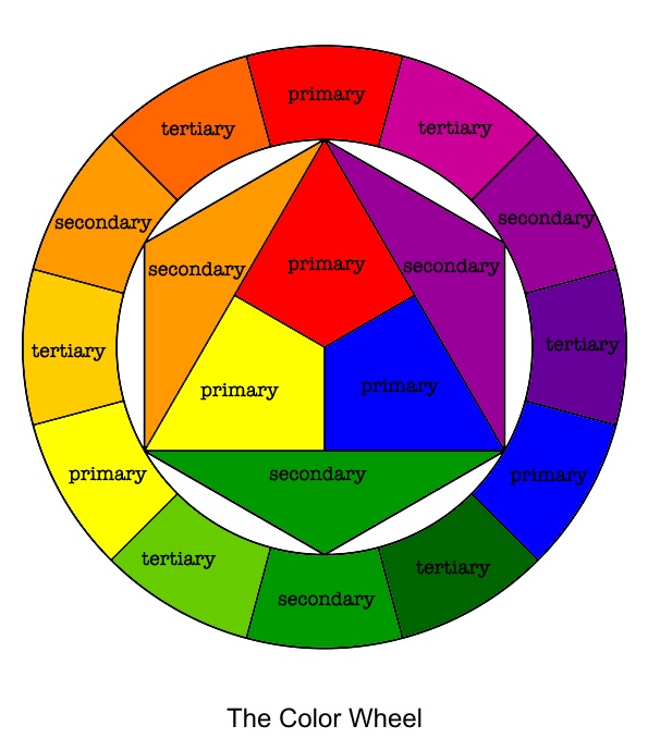
The Color Wheel: Primary, Secondary, and Tertiary Colors
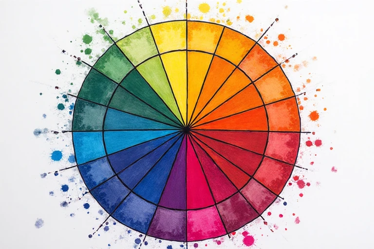
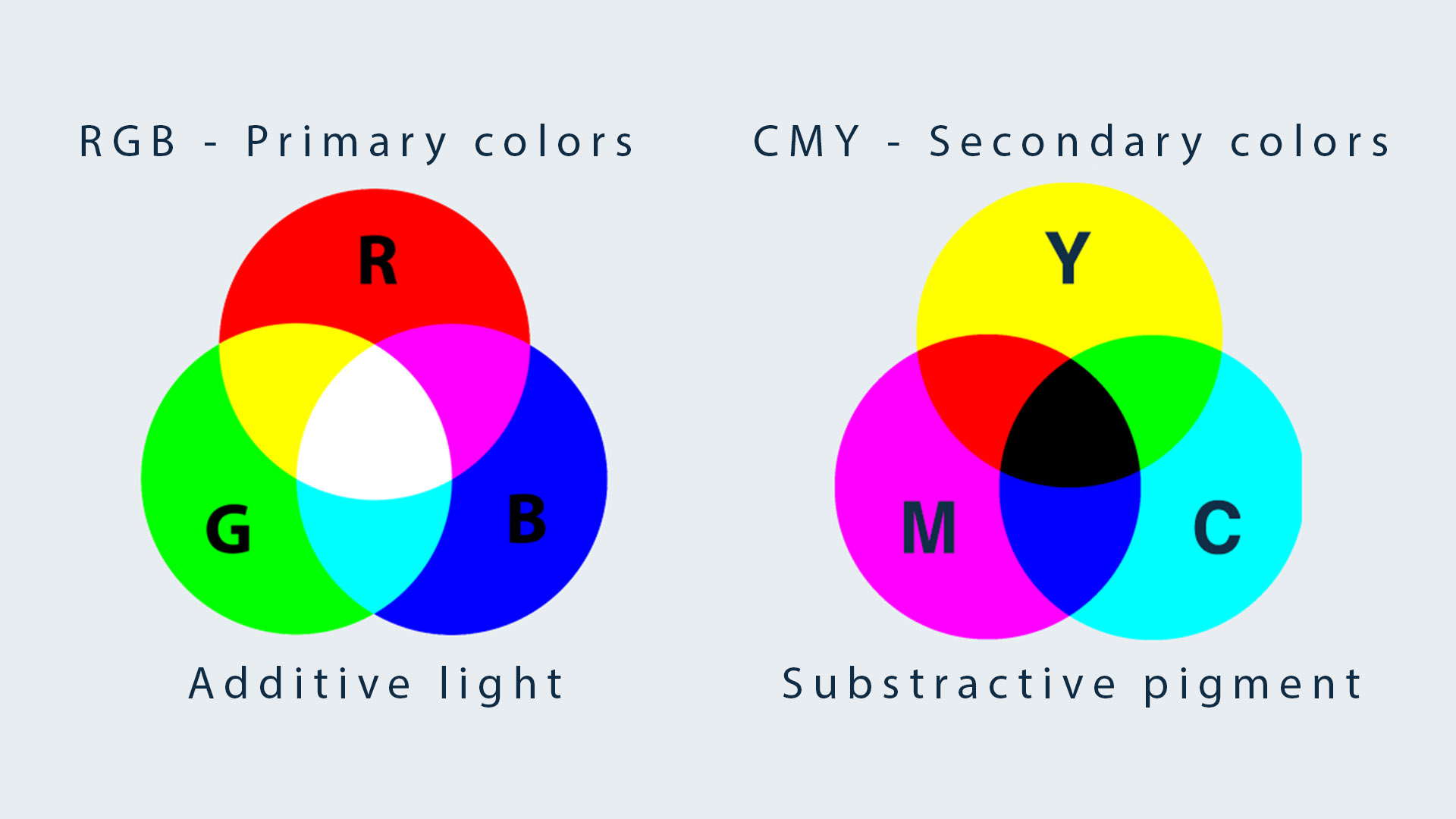
The color wheel, invented by Sir Isaac Newton in 1666, is a simple guide to color meaning in elements of art and video games. It’s a circle showing how colors connect and work together. The wheel includes primary colors—red, yellow, and blue—which are the building blocks for all other hues. Mixing two primaries makes secondary colors: red and yellow create orange, yellow and blue make green, and blue and red form purple. Then, mixing a primary with a secondary gives tertiary colors, like magenta, amber, or teal, adding more variety.
The wheel splits into warm colors like reds and oranges, which feel energetic, and cool colors like blues and greens, which feel calm. In art, Gauguin used warm oranges to show tropical heat, while Horizon Zero Dawn uses them for fiery battles, adding excitement. For cool color meaning in art, Monet’s blue lakes feel peaceful, and Ori and the Will of the Wisps uses blues in forests to soothe players. The color wheel meaning in art helps artists and game designers balance colors, create moods, and guide attention, making every scene in a painting or game feel alive and meaningful.
| Color Category | Colors | Description | Meaning in Art |
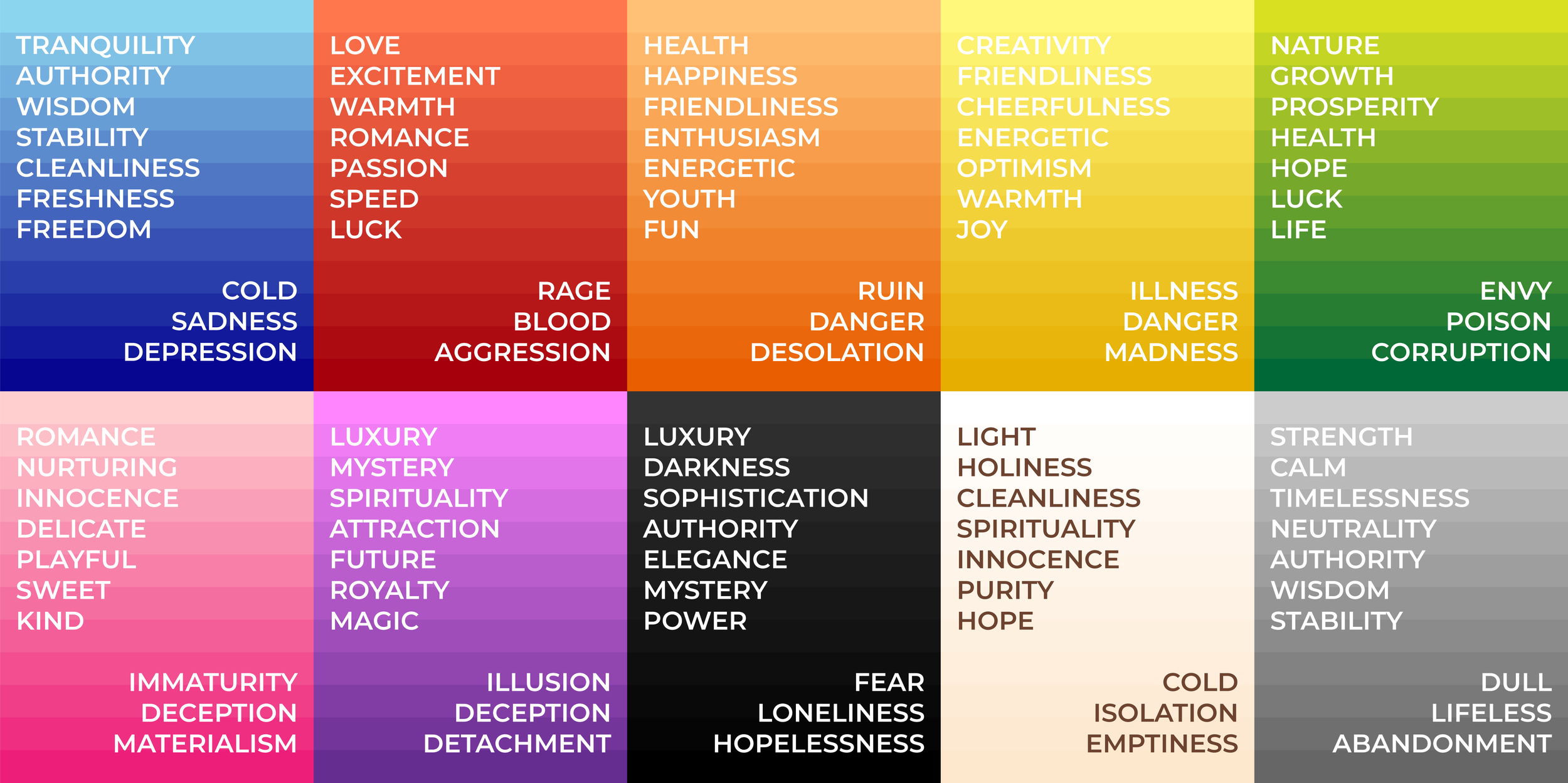
| Primary Colors | Red, Yellow, Blue | The fundamental colors that cannot be made by mixing other colors. | Red symbolizes passion and energy.Yellow represents happiness and warmth.
Blue conveys calmness and peace. |
| Secondary Colors | Orange, Green, Purple | Created by mixing two primary colors. | Orange represents enthusiasm and creativity.Green signifies growth, nature, and harmony.
Purple embodies mystery, luxury, and spirituality. |
| Tertiary Colors | Magenta, Vermillion, Amber, Chartreuse, Teal, Violet | Formed by mixing a primary color with a neighboring secondary color. | Magenta symbolizes creativity and transformation.Vermillion (reddish-orange) conveys excitement and warmth.
Amber represents energy and confidence. Chartreuse (yellow-green) signifies freshness and vitality. Teal expresses tranquility and sophistication. Violet represents wisdom, imagination, and mystery. |
The wheel splits into warm color meaning in art (reds, oranges) for energy and cool color meaning in art (blues, greens) for calm. In color meaning in art painting, Gauguin uses warm oranges for tropical heat, while Horizon Zero Dawn’s orange color meaning in art intensifies battles.
| Color Type | Art Example | Meaning in Art | Game Example | Meaning in Games |
| Primary (Yellow) | Van Gogh – “Sunflowers” | Yellow symbolizes warmth, hope, and emotional intensity, bringing vibrancy to paintings. | Super Mario Sunshine | Represents happiness, light, and positivity, reflecting the game’s bright and cheerful atmosphere. |
| Primary (Red) | Mark Rothko – “Red on Red” | Red conveys passion, power, and intensity, often evoking strong emotions. | Street Fighter (Ken’s Outfit) | Red symbolizes strength, aggression, and confidence in gaming characters. |
| Primary (Blue) | Picasso – “The Old Guitarist” | Blue evokes melancholy, calmness, and introspection, emphasizing deep emotions. | The Legend of Zelda: Breath of the Wild (Sheikah Tech) | Blue often represents wisdom, magic, and mystery in games. |
| Secondary (Green) | Monet – “Water Lilies” | Green symbolizes nature, renewal, and peace, enhancing the serenity of landscapes. | Hollow Knight (Greenpath area) | Represents growth, mystery, and nature, with hidden dangers lurking in lush areas. |
| Secondary (Orange) | Edvard Munch – “The Scream” | Orange signifies energy, excitement, and intensity, often creating dramatic effects. | Crash Bandicoot | Often associated with adventure, fun, and high-energy action. |
| Secondary (Purple) | Gustav Klimt – “The Kiss” | Purple represents mystery, luxury, and spirituality, adding depth to compositions. | Spyro the Dragon | Purple often signifies magic, fantasy, and royal themes in gaming. |
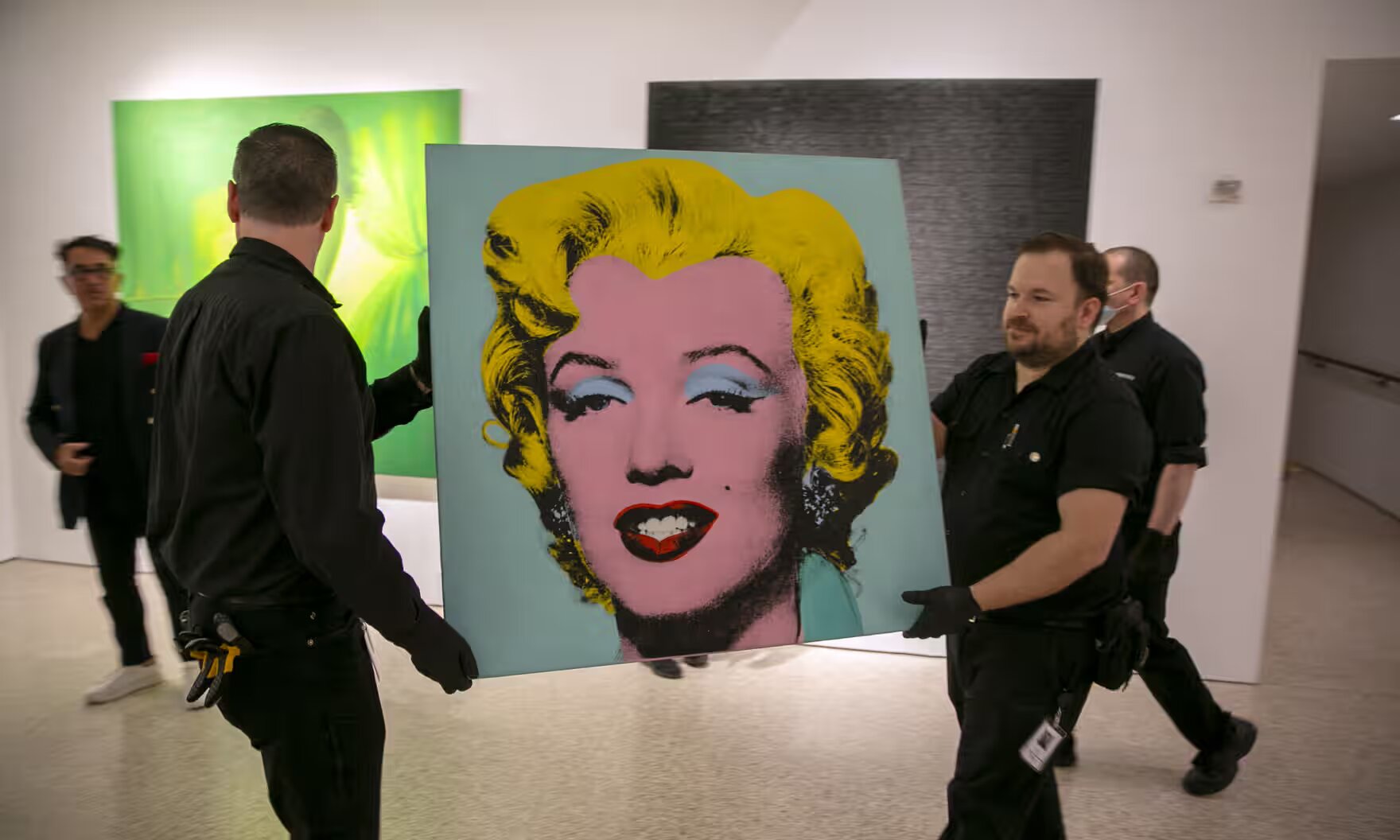
| Tertiary (Magenta) | Andy Warhol – “Marilyn Monroe” | Magenta conveys boldness, creativity, and modernity, making artwork pop. | Splatoon (Ink Color Options) | Magenta is used to emphasize energetic, futuristic, and playful aesthetics. |
| Tertiary (Vermillion) | Turner – “Sun Setting over a Lake” | Vermillion (reddish-orange) symbolizes warmth, passion, and an intense, fiery effect. | The Legend of Zelda: Ocarina of Time (Gerudo Valley) | Often used to show desert landscapes, heat, and warrior strength. |
| Tertiary (Amber) | Rembrandt – “The Night Watch” | Amber adds richness, nostalgia, and warmth to paintings, creating an inviting atmosphere. | Fallout Series (Pip-Boy Interface) | Amber is used in post-apocalyptic settings to evoke a sense of survival and old technology. |
| Tertiary (Chartreuse) | Henri Matisse – “The Joy of Life” | Chartreuse (yellow-green) represents energy, vitality, and liveliness in art. | Luigi’s Mansion | Chartreuse often symbolizes eerie, ghostly, or toxic elements in games. |
| Tertiary (Teal) | Georgia O’Keeffe – “Blue and Green Music” | Teal is associated with tranquility, sophistication, and a modern aesthetic. | Portal (Aperture Science Design Aesthetic) | Teal represents advanced technology, mystery, and intelligence. |
| Tertiary (Violet) | Claude Monet – “Impression, Sunrise” | Violet conveys imagination, dreaminess, and soft elegance in artwork. | Final Fantasy Series (Magic Effects & Crystals) | Often used for magic, illusion, and legendary items in gaming. |
The color wheel meaning in art balances compositions, while games like Ori and the Will of the Wisps use blue color meaning in art in forests to soothe players, showing how colors shape narratives.
The Color Harmony Meaning in Art and Games
Color harmony definition involves pairings that please the eye, creating balance through strategic combinations. The color harmony meaning in art includes:
Complementary Colors Meaning: High Contrast for Impact
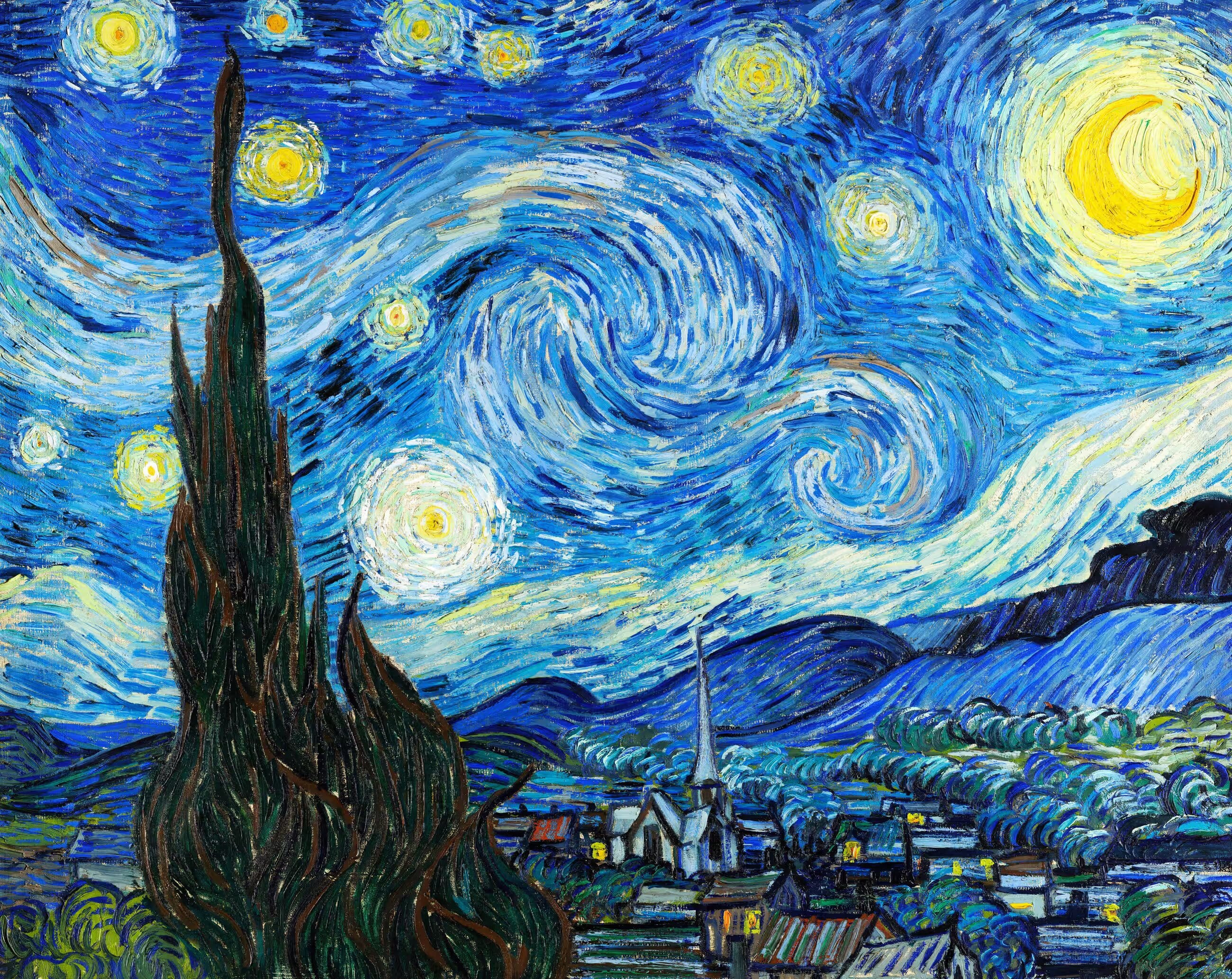
Complementary colors are opposites on the color wheel, like red and green, creating a striking contrast that grabs attention. In art, Vincent van Gogh used blue and orange in his starry night skies to make the stars pop against the dark background, adding drama. In video games, Overwatch uses this trick too—blue for one team and orange for the other—so players can quickly spot friends or foes during fast battles. This high-contrast pairing makes things stand out, whether it’s a glowing star or an enemy target. It’s a simple way to add energy and focus to a scene, ensuring the viewer or player knows exactly where to look. Complementary colors bring excitement and clarity to both art and games.
Opposites like red and green for contrast.
- Art: Van Gogh’s blue-orange stars.
- Games: Overwatch’s team colors.
Analogous Colors Meaning: Harmony Through Similarity
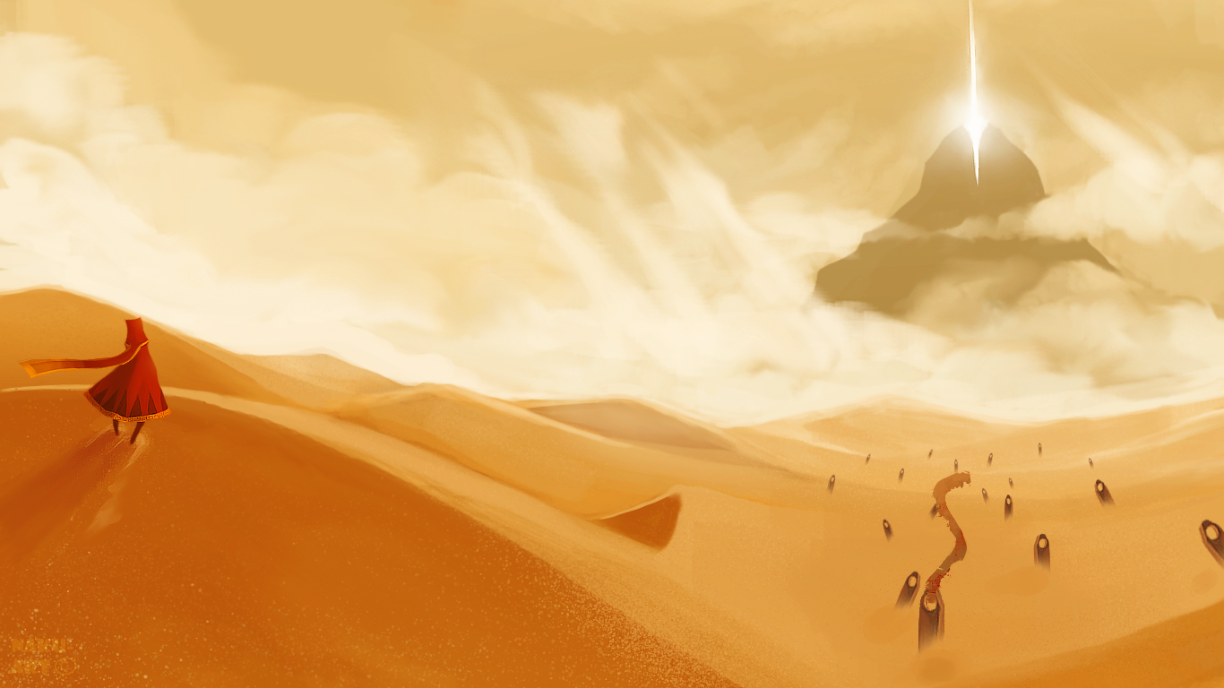
Analogous colors sit next to each other on the color wheel, like blue, teal, and green, creating a smooth, harmonious look. In art, Claude Monet used this in his water lily paintings, blending soft blues and greens to make peaceful pond scenes that feel calm and natural. In video games, Journey applies analogous blues and purples in its sandy dunes, giving a spiritual, flowing vibe as players glide through the desert. These colors work together because they’re similar, making the scene feel unified and easy on the eyes. It’s like a gentle wave of color that doesn’t clash, perfect for creating serene or cohesive settings. Analogous colors help art and games feel connected and soothing, inviting viewers and players into a relaxed experience.
Neighbors like blue, teal, green for harmony.
- Art: Monet’s water lilies.
- Games: Journey’s blue-purple dunes.
Triadic Colors Meaning: Vibrant and Balanced Triangles
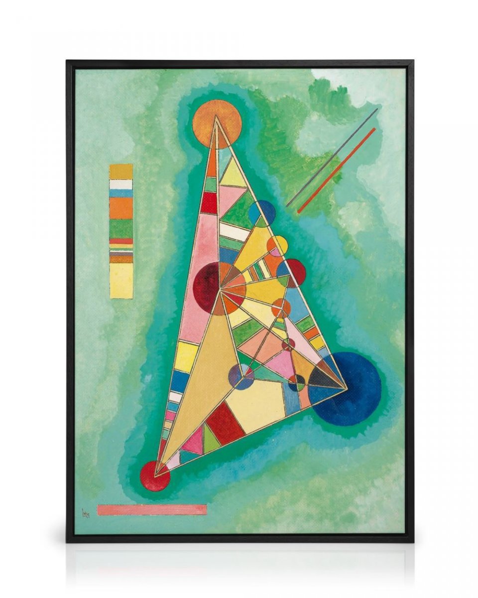
Triadic colors are three hues equally spaced on the color wheel, like red, yellow, and blue, forming a vibrant triangle. In art, Wassily Kandinsky used this in his abstract works, mixing bold reds, yellows, and blues to create lively, balanced paintings that feel energetic yet harmonious. In video games, Cuphead uses triadic colors in its 1930s cartoon style, with red, yellow, and blue popping in characters and backgrounds, making every level feel dynamic and playful. This combination keeps things exciting without clashing, as the colors balance each other out. It’s a great way to add variety while keeping a sense of unity. Triadic colors bring a cheerful, vibrant energy to both art and games, making them feel alive and engaging for viewers and players alike.
Three equidistant hues (e.g., red, yellow, blue).
- Art: Kandinsky’s vibrant triangles.
- Games: Cuphead’s bold triads.
Monochrome: Depth with a Single Hue
Monochrome harmony uses tints, shades, and tones of one color, like different grays from a single hue. In art, Pablo Picasso often used monochrome in his sketches, like a grayscale drawing, to focus on form and emotion without color distraction, creating depth and mood. In video games, Hades uses monochrome tones in its underworld, with deep reds and their shades to build a unified, intense atmosphere that feels otherworldly. This approach adds sophistication by playing with light and shadow within one color family. It’s simple but powerful, letting the artist or developer emphasize texture and feeling. Monochrome harmony brings a sleek, focused look to art and games, drawing attention to details and creating a strong, cohesive vibe that resonates with the audience.
Tints and shades of one hue.
- Art: Picasso’s grayscale sketch.
- Games: Hades’s underworld tones.
| Harmony Type | Art Example | Video Game Example | Effect Created |
| Complementary | Van Gogh’s blue-orange stars in Starry Night | Overwatch’s blue vs. orange team colors | High contrast, draws focus |
| Analogous | Monet’s blue-green water lilies | Journey’s blue-purple desert dunes | Smooth, calming harmony |
| Triadic | Kandinsky’s red-yellow-blue abstracts | Cuphead’s red-yellow-blue cartoon style | Vibrant, balanced energy |
| Monochrome | Picasso’s grayscale sketches | Hades’s red-toned underworld | Depth, cohesive intensity |
These harmonies shape mood—whether it’s the violet color meaning in art for mystery in Final Fantasy or color meaning in art examples like Zelda’s serene forests—making visuals impactful.
How Local Color Meaning in Art and Games Shifts with Culture
Color context explores how perception changes with surroundings, culture, and psychology. The local color meaning in art varies:
Cultural Shifts:
- Local color meaning in Hindi: White symbolizes mourning, seen in temple murals.
- In Assassin’s Creed Shadows, white-clad mourners reflect Japanese traditions.
Psychological Impact:
- Red color meaning in art: Danger in a Goya war scene.
- Color meaning in Egyptian art: Green for rebirth in Abzû’s oases.
| Context | Art Example | Game Example |
| Cultural (White) | White color meaning in art in Indian art | Mourning in Far Cry |
| Psychological (Gray) | Dull color meaning in art in Hopper | Dark color meaning in art in Silent Hill |
The meaning of black color in art (mystery) in Goya mirrors Dark Souls’ voids, showing how context shapes color meaning in art across mediums.
Color Palette Meaning in Art and Video Games
Colors carry deep color palette meaning in art and games, blending psychology and culture:
Red: Power and Passion in Art and Games
Red symbolizes power and passion, making it a bold choice in the red color meaning in art. In Henri Matisse’s paintings, red fills dance scenes with energy, showing joy and movement. In video games, DOOM uses red in its fiery arenas to signal danger and intensity, pushing players into action. This color grabs attention and sparks excitement, whether on a canvas or a screen. Red’s vibrant energy makes scenes feel alive and urgent, perfectly capturing moments of high emotion or conflict in both art and gaming.
Blue: Peace and Calm in Art and Games
Blue represents peace and calm, a key part of the blue color meaning in art. Claude Monet used soft blues in his lake paintings, creating a soothing, tranquil vibe that feels like a quiet escape. In video games, Pokémon’s bright blue skies give a sense of freedom and calm as players explore new regions. Blue helps viewers and players feel relaxed, making it ideal for serene settings. Its calming effect brings a sense of safety and confidence, inviting a peaceful experience in both art and gaming worlds.
Purple: Luxury and Mystery in Art and Games
Purple stands for luxury and creativity, as seen in the violet color meaning in art. Gustav Klimt used purple in his elegant portraits to show wealth and beauty, adding a regal touch. In Persona 5 animation, the casino level glows with purple, creating a luxurious, mysterious vibe that fits its stylish theme. This color adds a sense of wonder and sophistication, making spaces feel special. Purple’s rich tone brings depth and intrigue, enhancing the artistic and gaming experience with a touch of magic and allure.
Black: Mystery and Depth in Art and Games
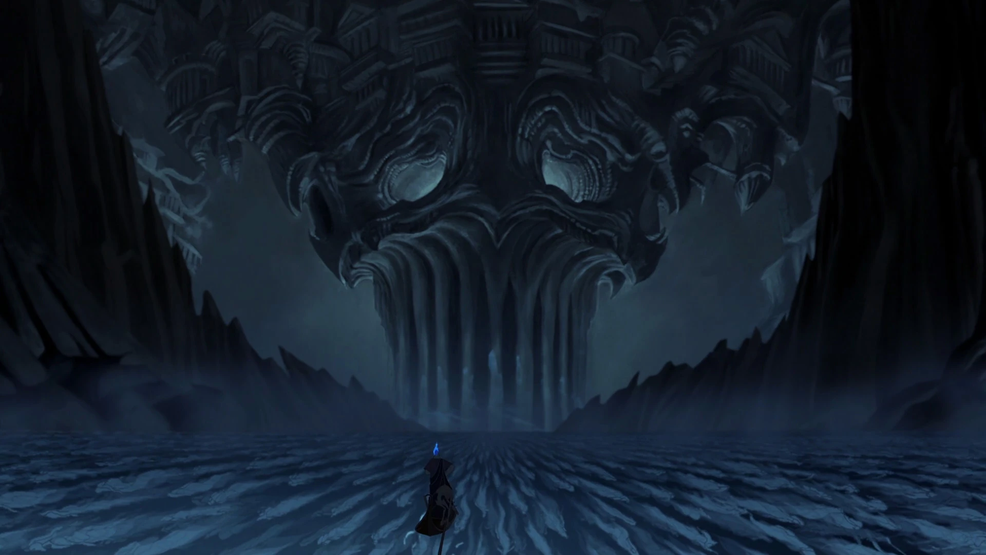
Black represents mystery and power, central to the meaning of black color in art. Francisco Goya used black in his dark scenes to create a haunting, mysterious mood, drawing viewers into the unknown. In Dark Souls, black voids fill the game, building tension as players face unseen dangers. This color adds depth and suspense, making scenes feel intense and shadowy. Black’s ability to hide and reveal makes it a powerful tool, creating a gripping atmosphere in both art and video games that keeps audiences on edge.
These meanings guide emotions, turning a brown color meaning in art into grounding in The Last of Us or color meaning in art into luxury in Uncharted.
Color Blocking Meaning in Art and Video Game Design
Colors come to life in different ways, shaping the color blocking meaning in art and video game design. There are two main types: additive color and subtractive color. Additive color uses light, where beams mix to create hues. When all wavelengths combine, you get white. A great example is Hades, where glowing effects light up the underworld with vibrant colors, making it feel magical and alive. On the other hand, subtractive color works with pigments, like paint or ink. Pigments absorb certain wavelengths, and when all are mixed, you get black. Think of Vincent van Gogh’s oil paintings, where thick, colorful strokes build deep, emotional scenes.
The color blocking meaning in art shines through bold contrasts. In Hades, bright glows against dark shadows define spaces and heighten tension as players explore. In art, Claude Monet used contrasting colors in his water lily paintings to separate the flowers from the pond, evoking peace. This technique helps artists and game designers guide attention, set moods, and tell stories. Whether it’s the glowing hues of a game or the textured layers of a painting, color blocking meaning in art uses these contrasts to create striking visuals that draw viewers and players into the experience with ease and excitement.
The Emphasis of Color
Colors are a universal language, using the emphasis of color to express the deeper meaning in art and games. A red sky in Red Dead Redemption 2 signals danger, while Celeste’s color shifts reflect emotional growth.
- Key Takeaways:
- The color wheel meaning in art guides palettes.
- Local color meaning in art and context shape perception.
- Color meaning in art therapy and games stirs emotions.
From black color meaning in art in Dark Souls to pink color meaning in art in Animal Crossing, colors tell stories. Experiment with harmonies, explore symbolism color meaning in art, and notice hues in your next game or gallery visit—they’re speaking to you!